Designing better ways to read, think, and respond.
Senior Product Designer → Design Manager | Interaction Design · UI Craft · Design Systems
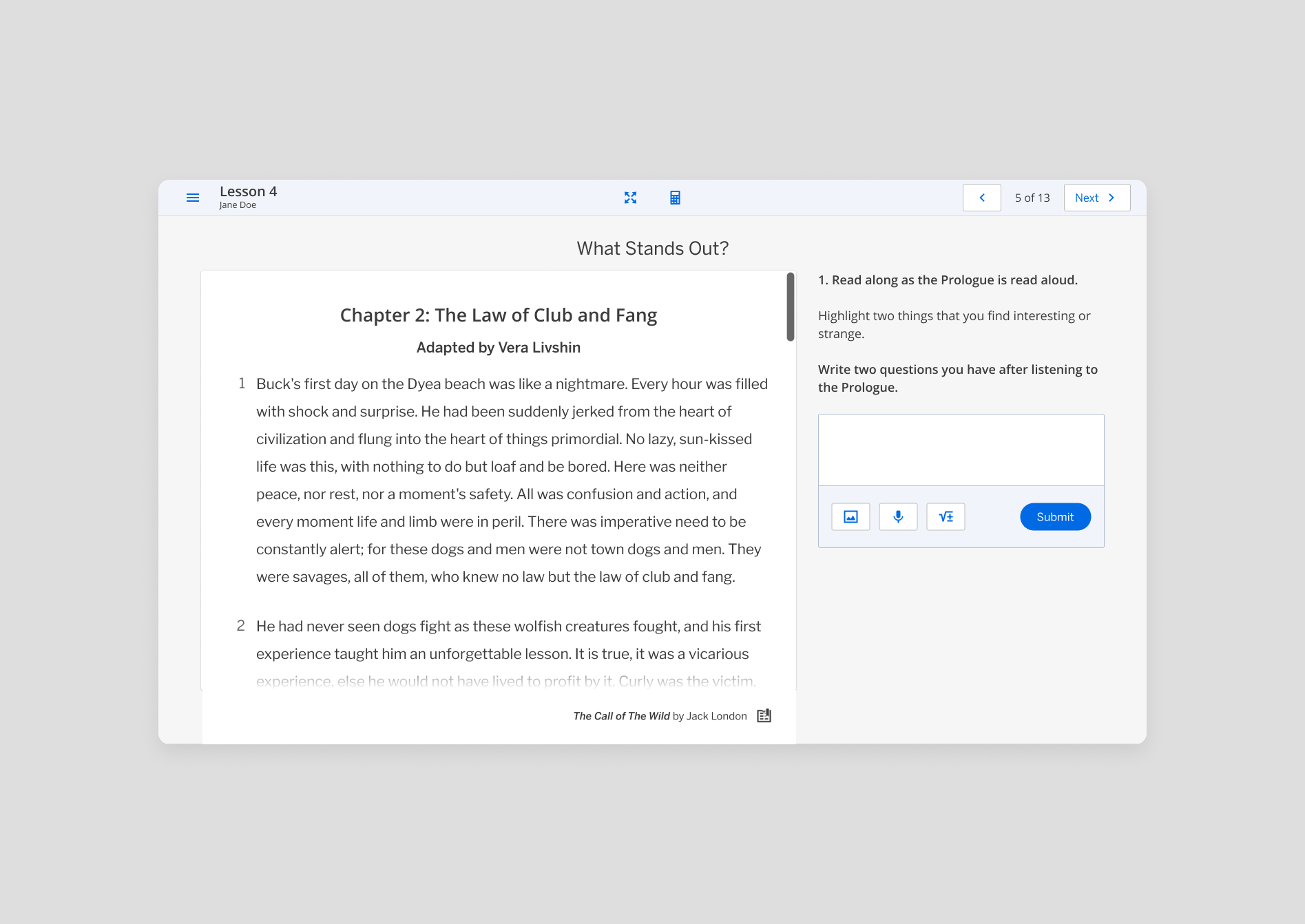
I designed and refined learning experiences and interaction patterns within Amplify’s existing reading platform, including Passage (eReader) layouts, paragraph selection, highlighting states and reading-plus-response workflows.
MY CONTRIBUTION
Students move between source material, instructions, annotations and written responses—often within the same activity. The design challenge was to preserve readability while supporting different types of learning work in the same workspace.
Designing around the way students engage with text.
01 · THE CHALLENGE
Finding the right balance of reading and response.
02 · HANDS-ON EXPLORATION
I explored flexible layouts that could adapt to different learning activities while keeping source material accessible as students worked.
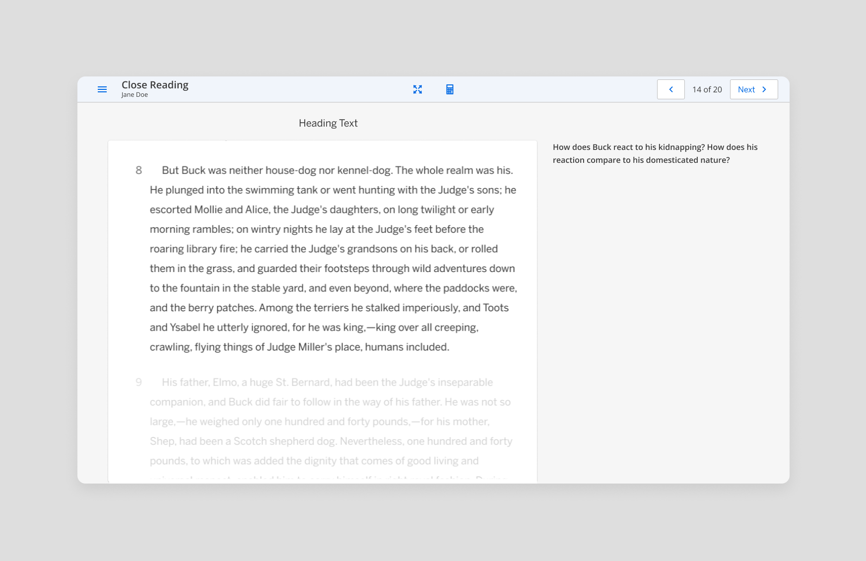
Reading-first
Passage takes priority
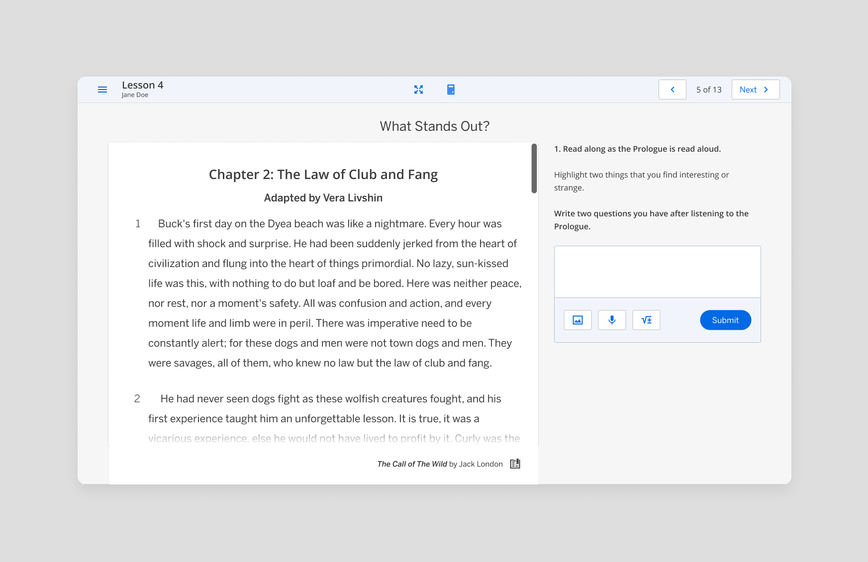
Balanced workspace
Reading + response
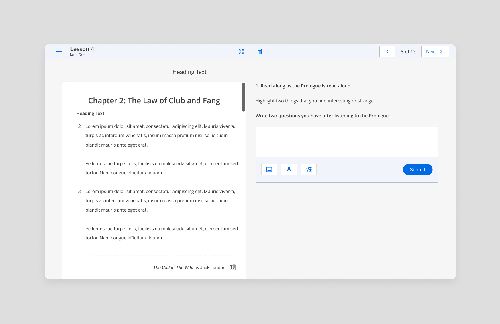
Equal workspace
Reading + response share the canvas
A workspace that adapts to the task.
03 · THE CORE DESIGN DECISION
Different activities place different demands on attention, so one fixed layout wasn’t enough.
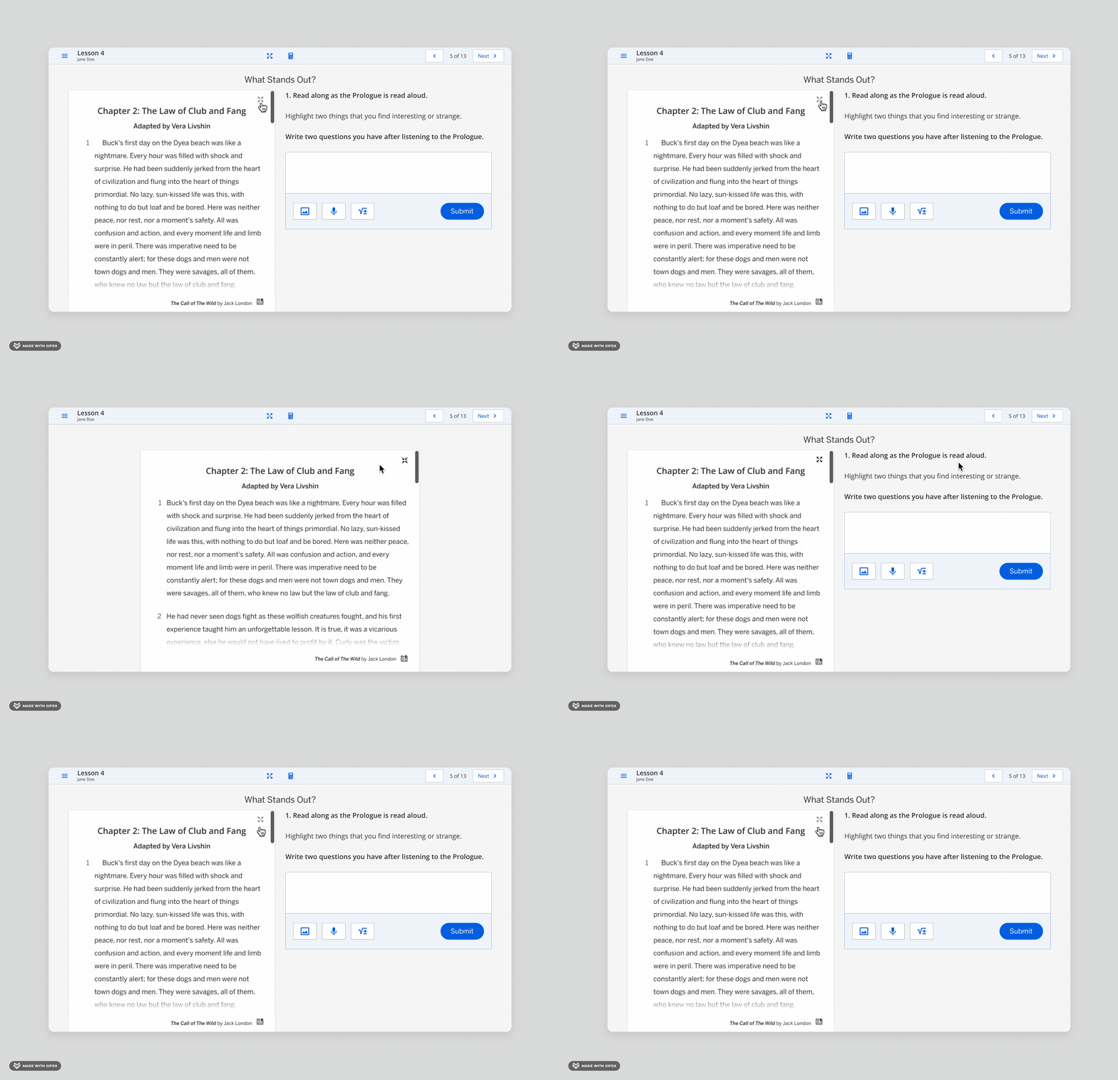
Full page · Immersive reading
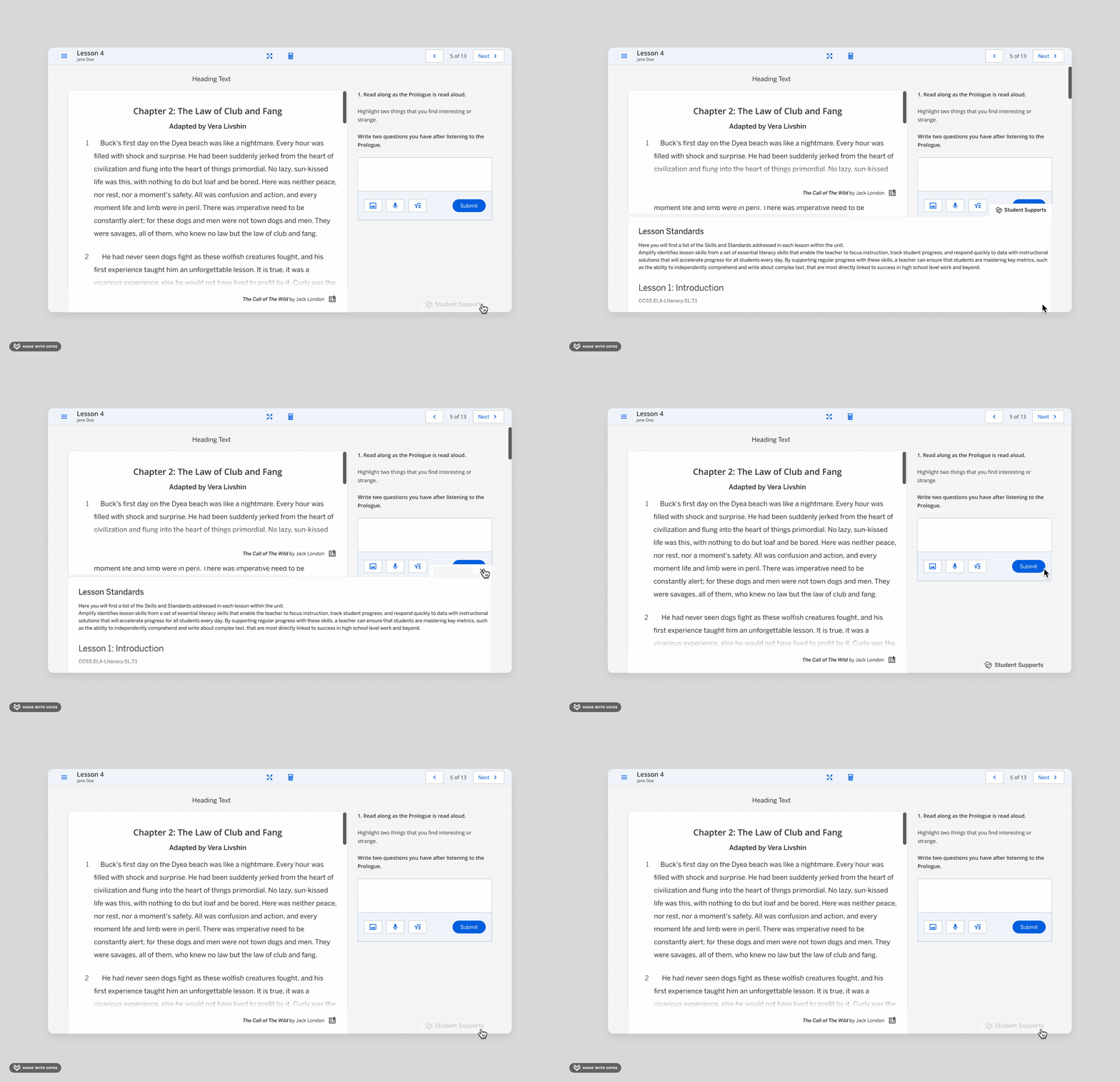
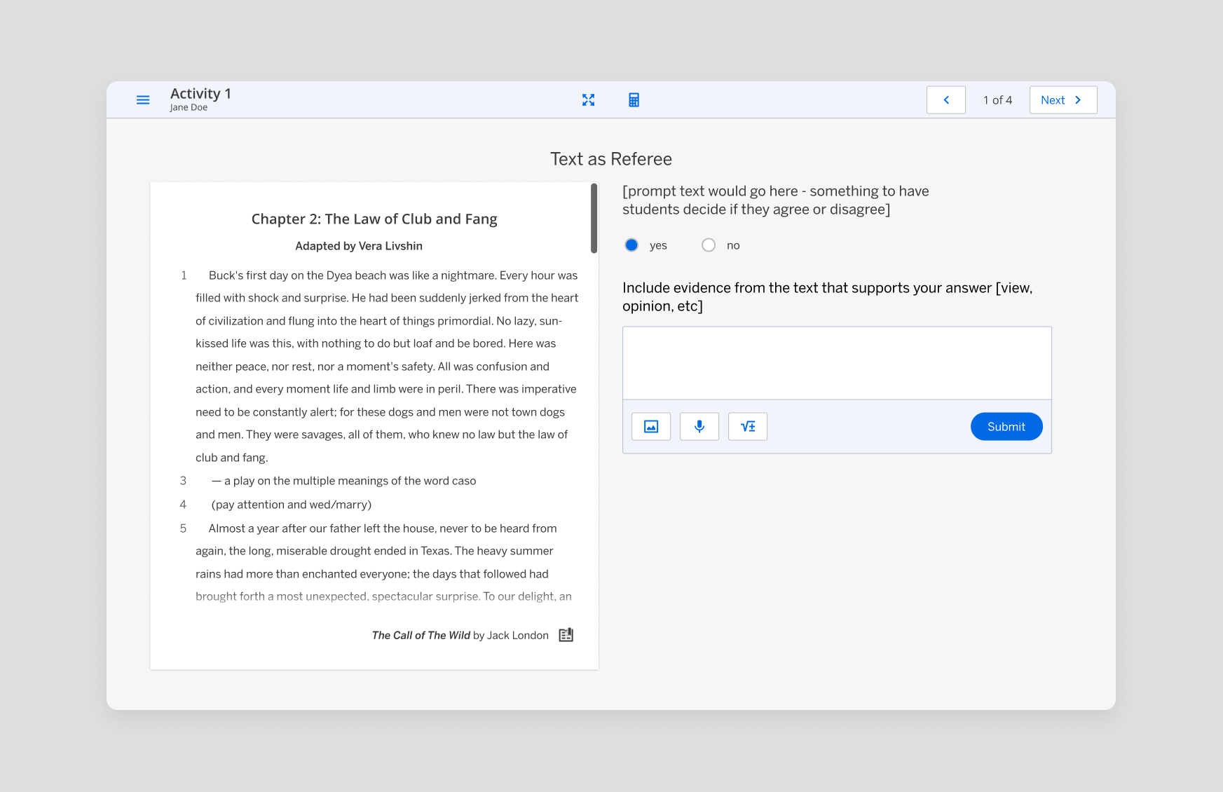
2/3 + 1/3 · Reading + support
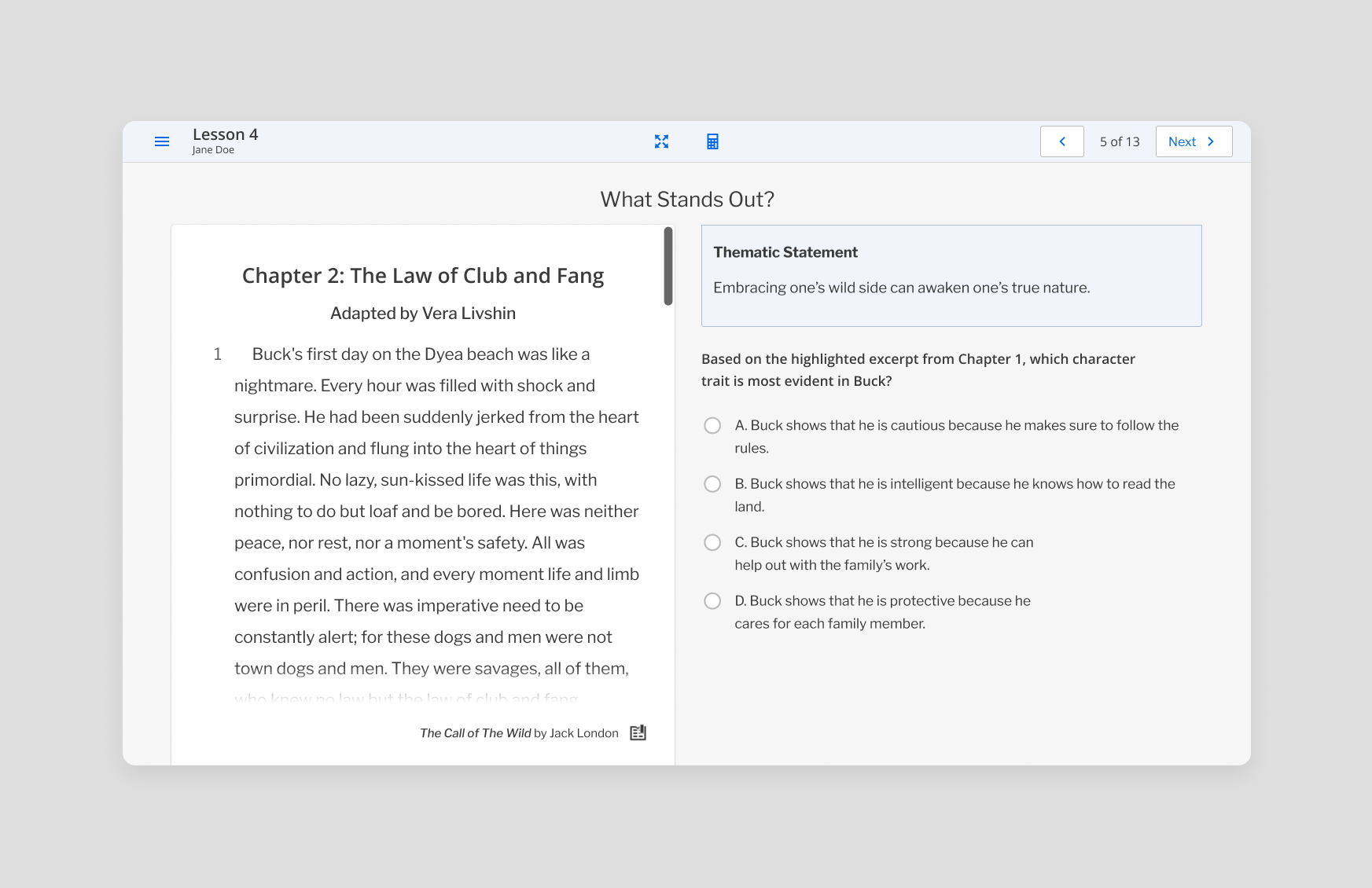
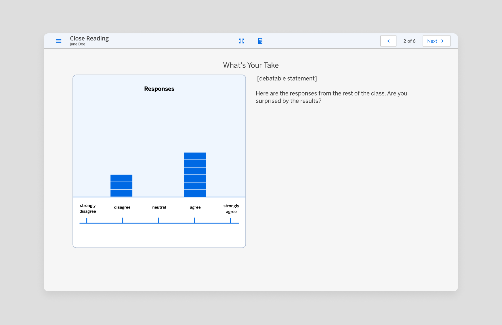
50 / 50 · Reading + substantial response
The interface needed to respond to the instructional purpose instead of forcing every activity into the same layout.
Why these variants?
Full-page reading
Prioritizes immersion and longer-form reading when no concurrent task needs equal visual weight.
2/3 + 1/3
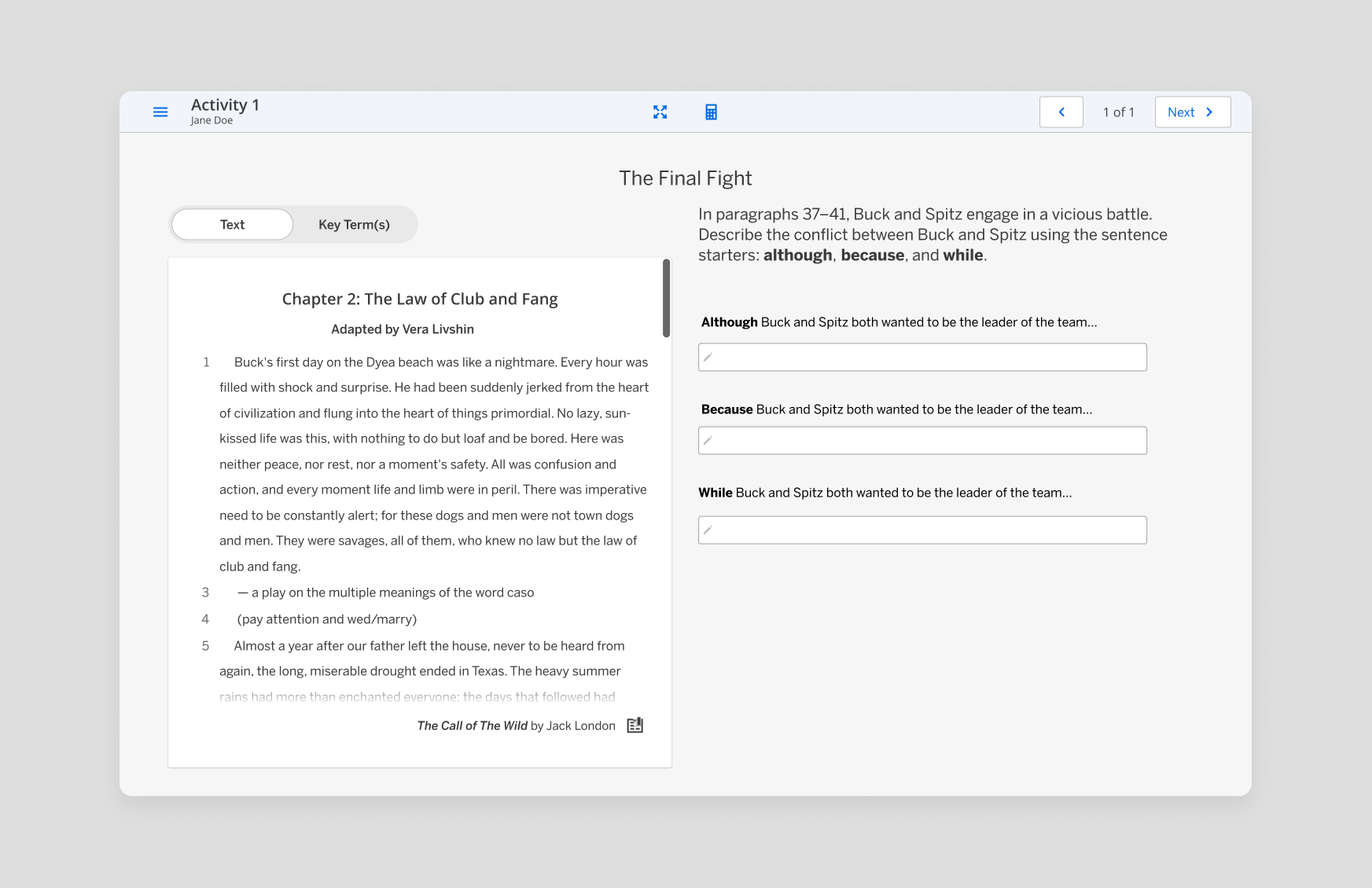
Keeps the passage dominant while supporting a lightweight prompt or reference.
50 / 50
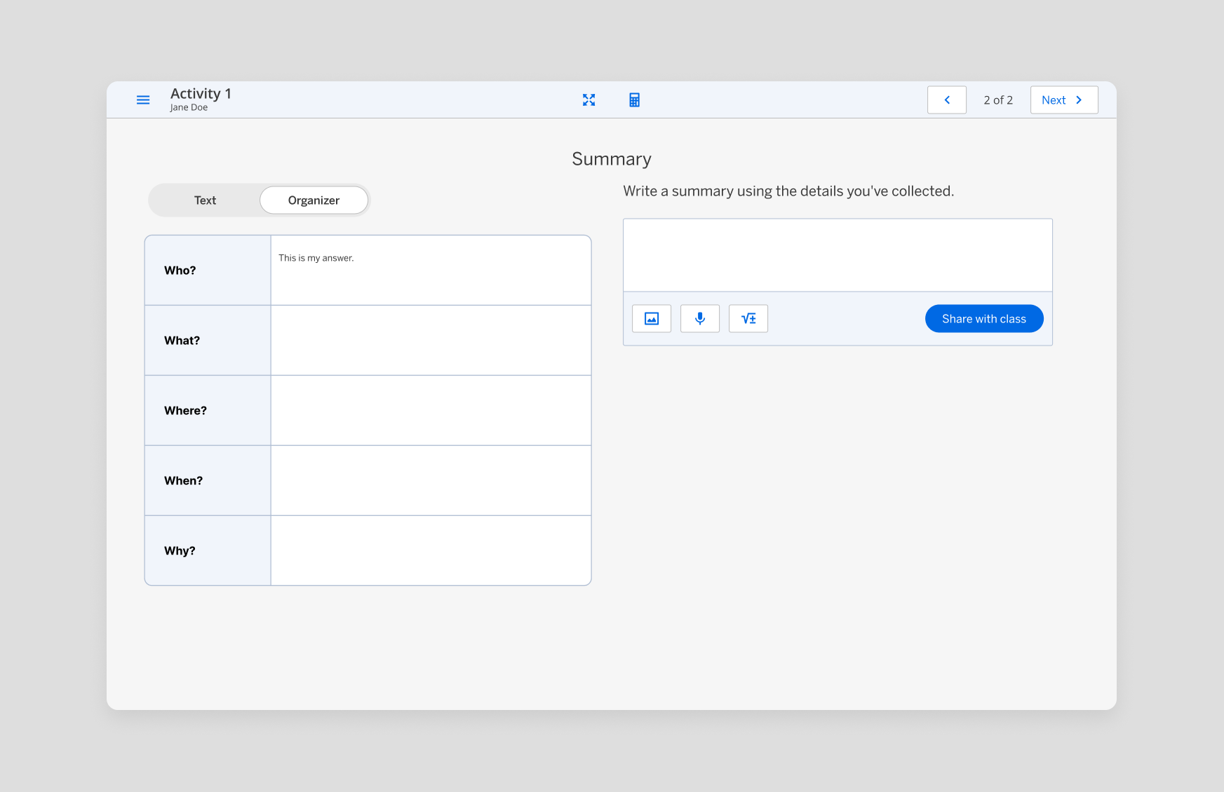
Gives writing and reading equal weight, as well as for activities where there is more text needed.
Making text interactive without losing readability.
04 · INTERACTION CRAFT
Selection and highlighting needed to communicate meaning without overpowering the content.
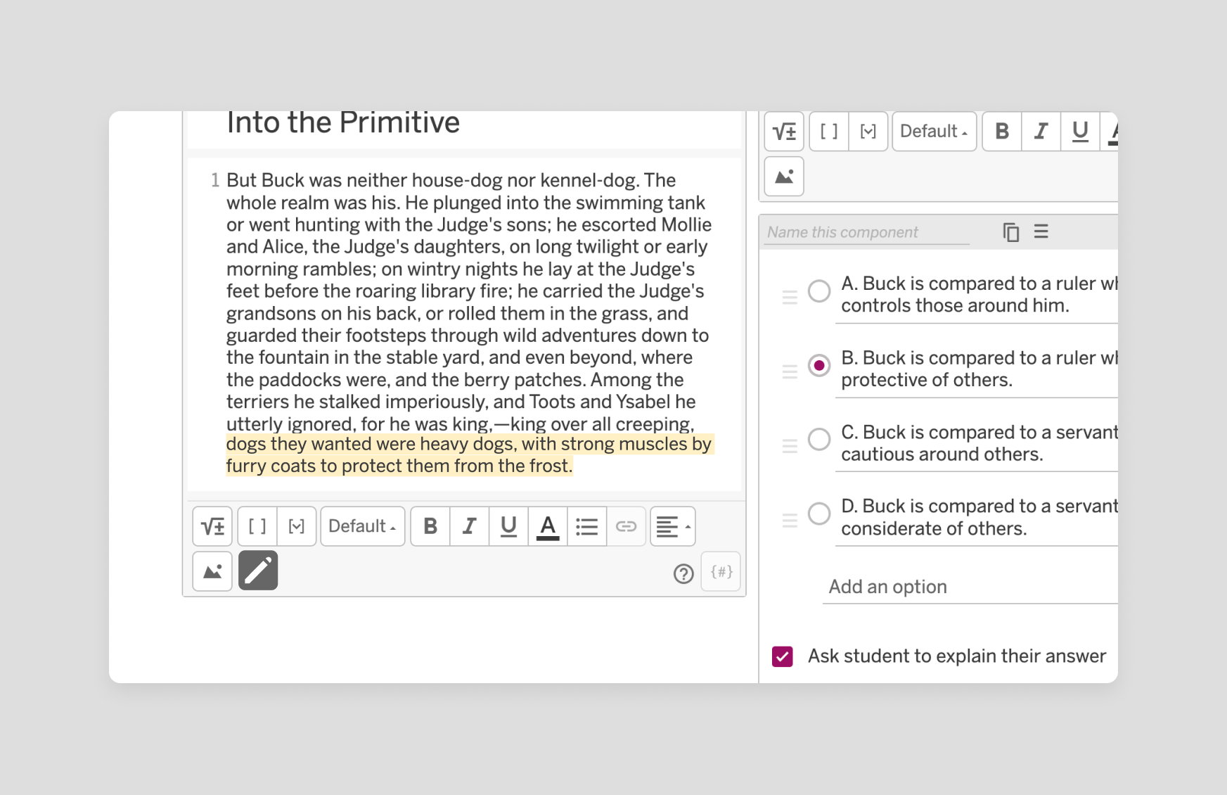
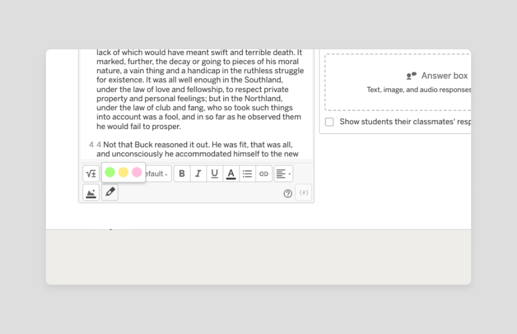
Helping students get to the right text faster.
When an instruction referred to a specific paragraph, I designed the passage to automatically scroll to that paragraph and visually bring it into focus.
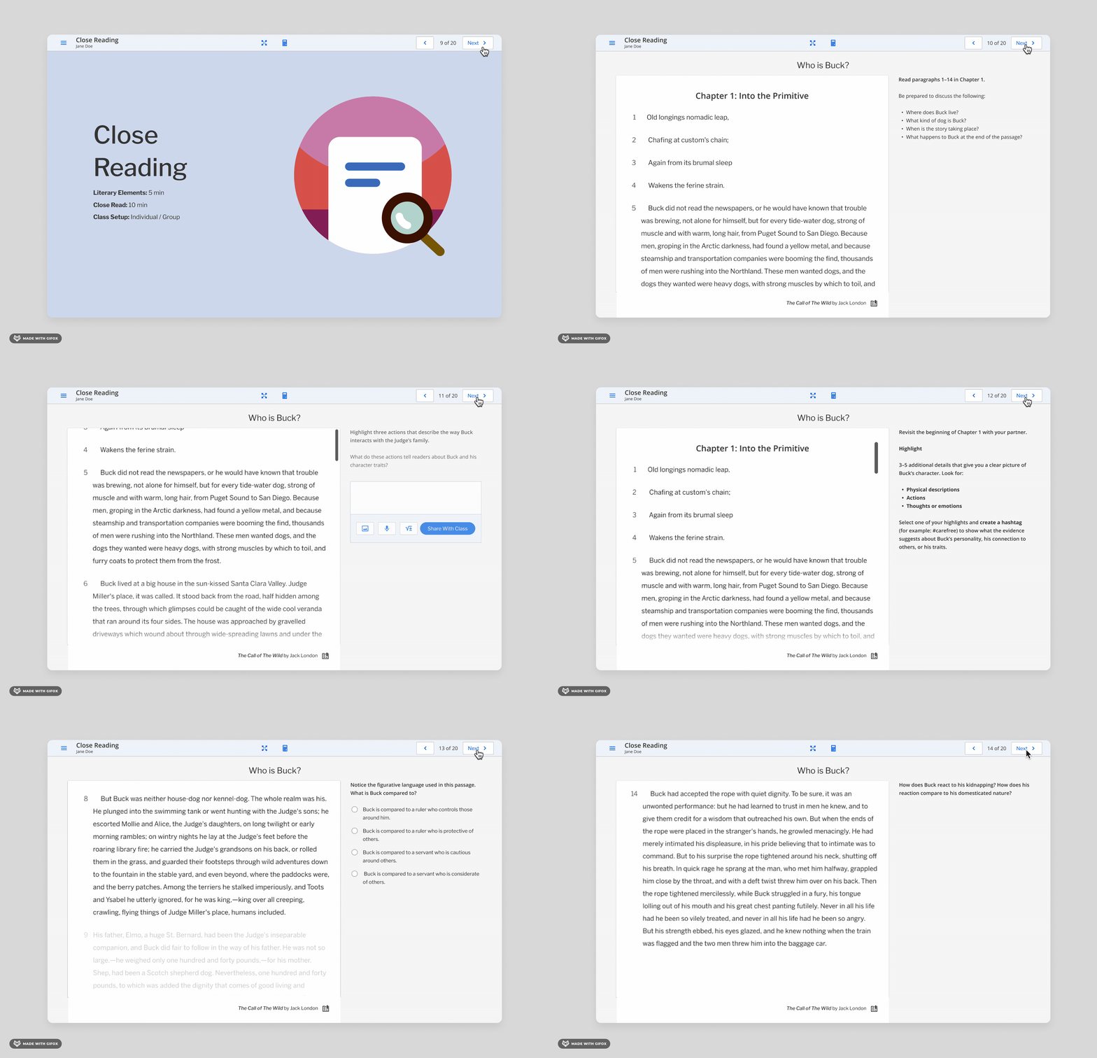
This reduced the amount of searching students had to do and kept attention on the instructional task.
05 · SHIPPED RESULT
From one activity to a reusable pattern.
The outcome wasn't just one screen. The flexible pattern could support different instructional contexts.
06 · LEADERSHIP
From designing experiences to raising the design bar.
As my role expanded into design management, I brought the same focus on craft into critique, reusable patterns, documentation, and team practices.